GSP College


We are excited to announce that GSP College will receive a major user interface upgrade this October. The redesigned platform will offer clearer visualisation of information, easier navigation, faster content discovery, and a seamless mobile-friendly experience.
Keep reading to learn about the new features and improvements that will make your learning journey smoother and more intuitive across all devices. This upgrade prioritises your experience, ensuring efficiency and engagement while maximising your time on GSP College.
Understanding detailed information is now a breeze. Our updated visual design presents information in a more refined and digestible way, so you can quickly grasp important insights and act with confidence. No more wasted time deciphering cluttered information.
Finding what you need has never been easier. With our new streamlined interface, you’ll spend less time searching and more time learning. Whether you’re looking for a specific course or completing regular tasks, the simplified layout helps you get where you need to be—fast.
Discover the learning content that matters most to you in a snap. The improved course Catalogue and personalised “My Learning” sections make it easier than ever to find the resources you need. Whether it’s a certification course or an on-demand webinar, everything is just a few clicks away.
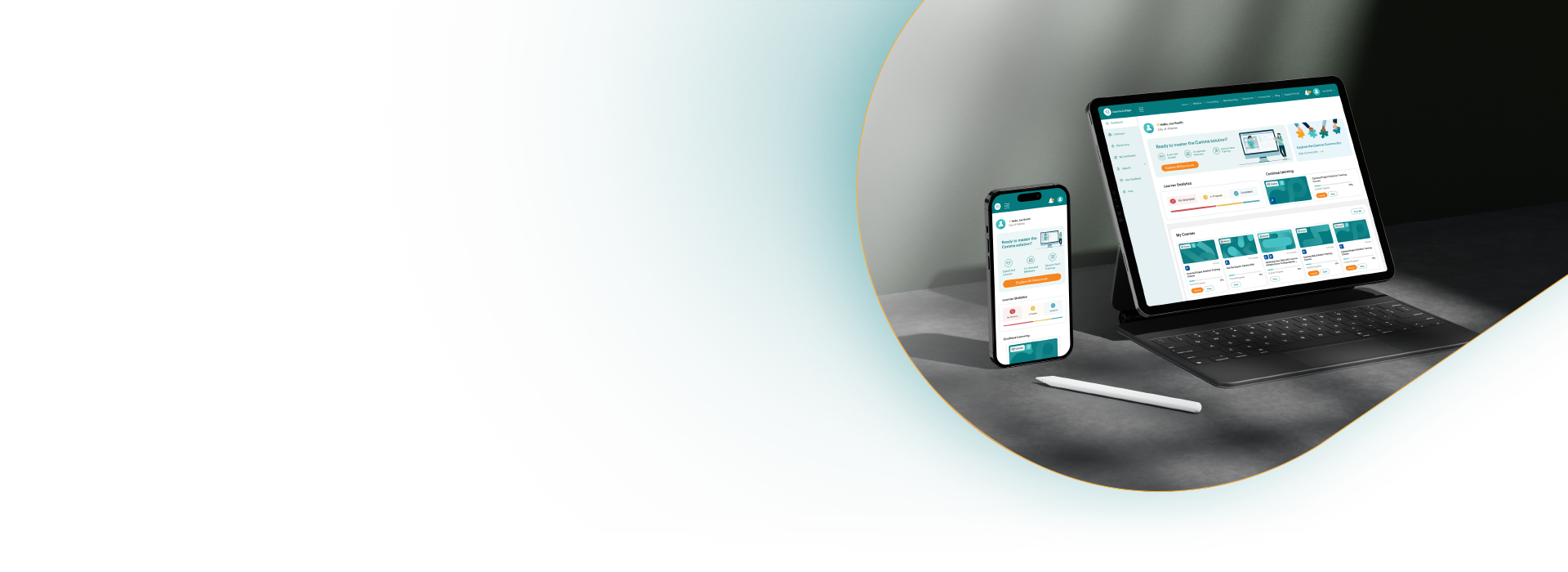
Stay productive on the go. GSP College now features an improved responsive, mobile-friendly design, offering the same smooth experience whether you’re on a desktop, tablet, or smartphone. You can access your learning anytime, anywhere—without sacrificing functionality or style.
The new GSP College UI aligns with the latest design standards across the entire Riskonnect suite, ensuring a consistent and seamless experience. Whether you’re navigating GSP – Risk, PPM, GSP – Strategy, or GSP College, you’ll enjoy a unified look and feel, making it easier to move between platforms without any friction.
When you log into GSP College after this release in November, you’ll notice several key changes that make learning even more enjoyable:
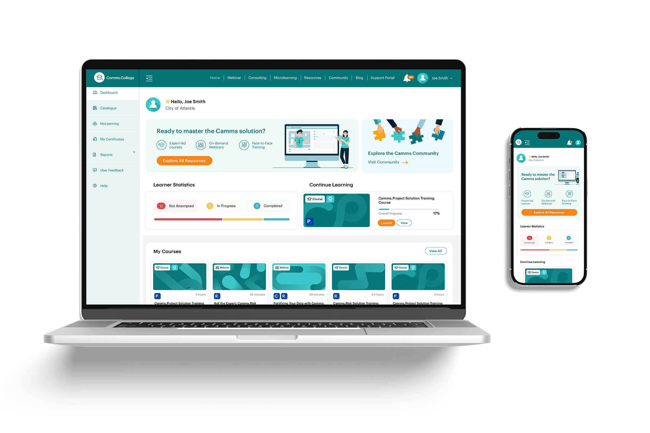 Figure 1.1: Sleeker Dashboard: Now with a “Continue Learning” button for quick access to your last activity and a prominent link to the Community.
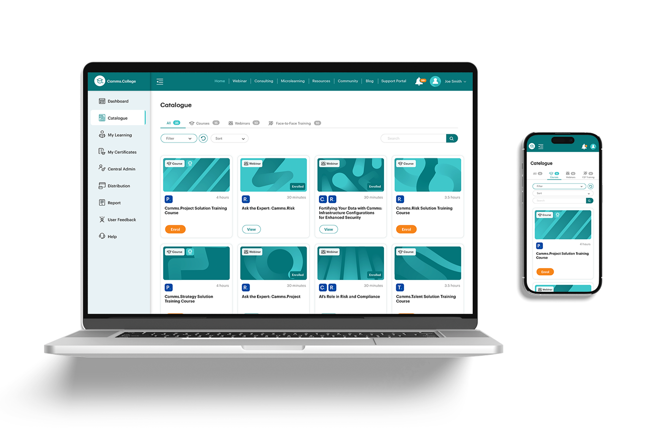 Figure 1.2: Enhanced Learning Catalogue: Quickly scan courses with redesigned tiles that show duration, content type, and certification status at a glance—so you can choose the right path with ease.
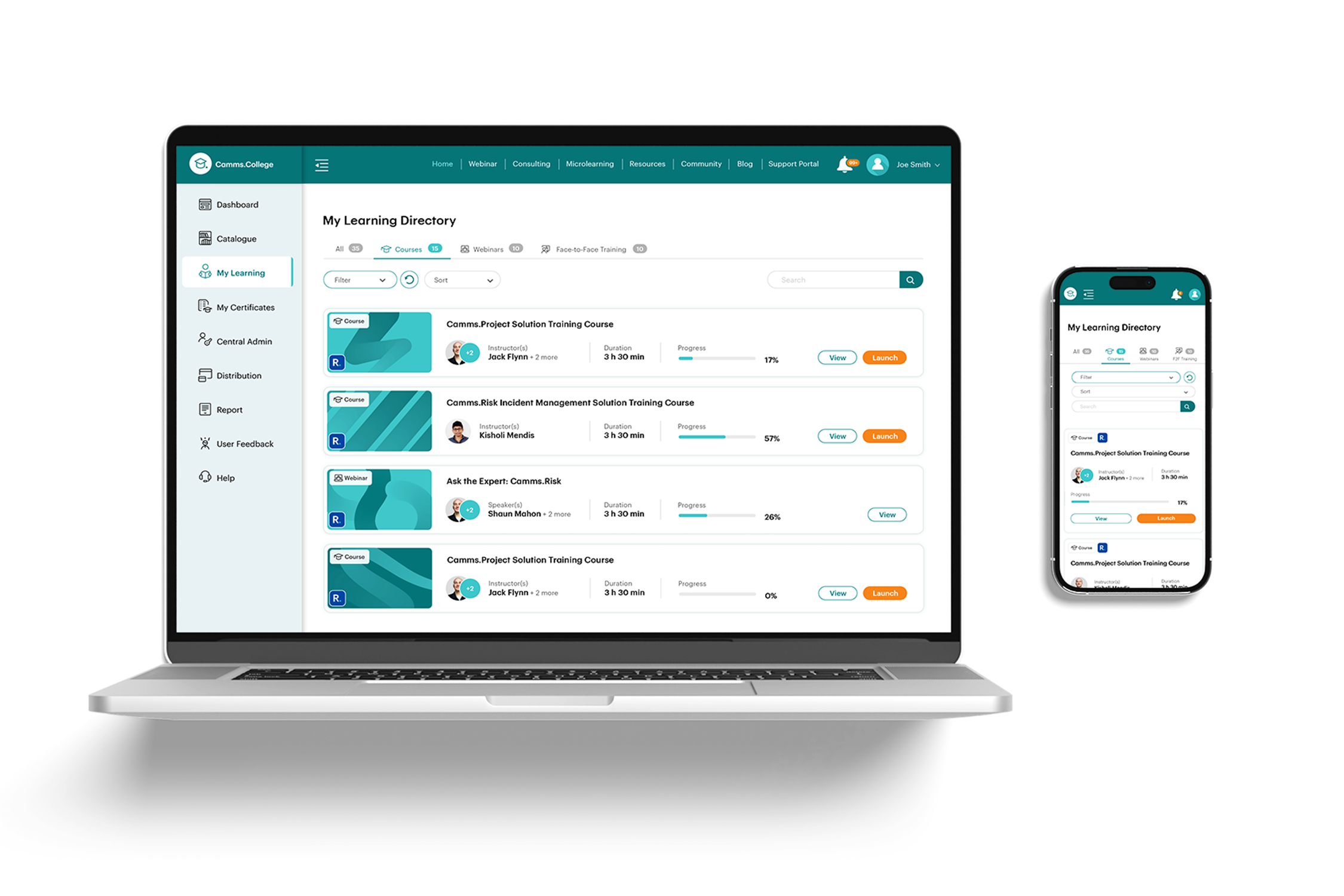 Figure 1.3: Simplified “My Learning” Section: Focus on what matters most—your learning. We’ve removed unnecessary clutter to help you stay on track and engage with the courses you care about.
 Figure 1.4: Upgraded Learning Activity Pages: Clearer learning activity details with added features like related activities, instructor bio’s and easy sharing options to help you engage with the content and share it with colleagues.
 Figure 1.5: Improved Navigation: Enhanced menus and upgraded widgets, like the Consulting Hours area, make it even easier to move through the platform and access the support you need.
This November upgrade is just the start. We’re committed to continuously improving your experience with GSP College, and there are many more exciting updates on the way. We can’t wait to hear your feedback as we evolve the platform to meet your learning needs.
The new GSP College UI will be launching in mid November. Get ready to experience a more intuitive, modern, and mobile-friendly learning platform designed to help you achieve more with less effort. Stay tuned for more updates—we’re excited for you to explore the new and improved GSP College soon!
To get a preview of what the updated UI looks like, don’t forget to watch our latest GSP College Product Walkthrough recording.