GSP - Risk


Imagine being able to view every risk, control, action, audit, or incident in your organisation – not just as isolated data points, but as part of a connected, real-time, visual story. That is exactly what the Risk Workspace Dashboard in GSP - Risk empowers you to do.
It goes beyond simple charts, offering a clear, structured view of your risk landscape to help you identify patterns, prioritise actions, and make informed decisions with confidence.
The Risk Workspace Dashboard is a powerful, visual interface that centralises key risk data across your organisation. It offers a filterable, hierarchy-driven view with dedicated tabs for Risks, Controls, Actions, Incidents, Compliance Requirements, and Audits, allowing users to explore insights without navigating across multiple modules.
Users can drill down using multiple filter options including organisational hierarchy, risk type, risk category, responsible owner, status, and overdue timelines—making it easy to surface the most relevant information for any role or department.
Whether you are a manager in local government needing to pinpoint overdue strategic risks, or a compliance officer in finance tracking audit actions, this dashboard transforms complexity into clarity, offering actionable insights in real time.
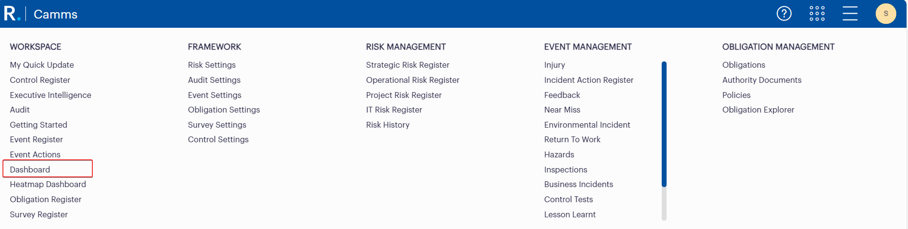 Figure 1.1: Main Navigation Menu in GSP - Risk Highlighting Access to the Risk Workspace Dashboard
 Figure 1.2: Alternative Access Point to the Risk Workspace Dashboard via the Risk Analysis Sidebar in GSP - Risk
Organisations often struggle with disconnected data, inconsistent reporting, and time-consuming manual analysis. The dashboard solves these by:
Who Benefits from This?
Local Government: Councils often manage hundreds of operational and strategic risks across departments. The hierarchy filters help visualise risks at a service or directorate level, while overdue risk and action widgets ensure nothing slips through the cracks.
Finance & Banking: Real-time insights into control effectiveness and overdue compliance actions help reduce exposure and support regulatory readiness. Risk heatmaps and matrix widgets offer assurance teams a bird’s-eye view of threat concentration and mitigation progress.
Healthcare: Hospitals and health services must track clinical, operational, and IT risks in tandem. Custom widget configurations and control owner ratings allow governance teams to see not just where the risks lie—but whether the controls are working.
Mining & Utilities: These industries rely on clear visualisation of top risks across multiple sites. The Risk by Org Level widget breaks down risks by operational location, while matrices show how well those risks are mitigated now and in the future.
Telecommunications: Fast-paced environments require visibility over incidents, audits, and controls across networks. The dashboard’s tabbed structure helps teams manage and report across different areas without toggling between modules.
Let us look at some standout tools that bring this dashboard to life.
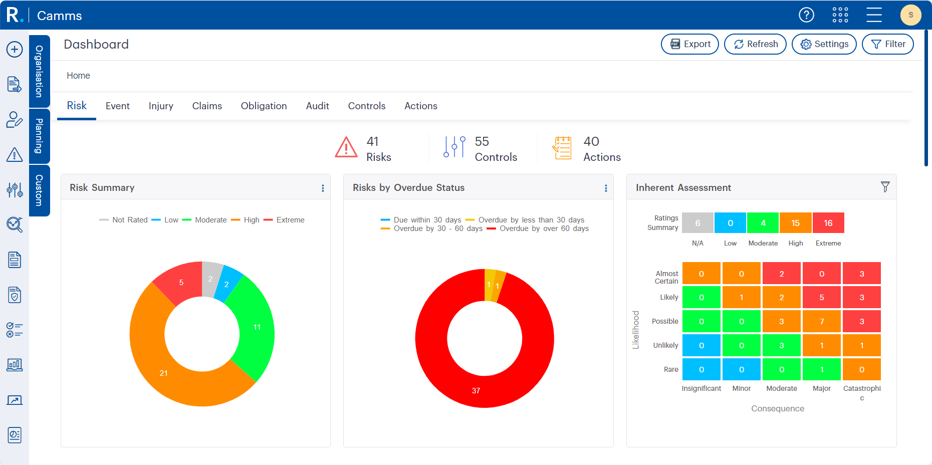 Figure 2.1: Risk Workspace Dashboard Interface with Key Visual Widgets in GSP - Risk
Hierarchy Filters & Drill-Down
Filter, navigate and drill down through the Organisation, Planning, or Custom hierarchies. Each user lands on their assigned hierarchy node but can easily switch context—ideal for regional, departmental, or enterprise-wide views.
 Figure 3.1: The expandable hierarchy panel lets users drill down into business areas like Corporate Strategy, Finance, or Operations, enabling focused views tailored to specific departments, functions, or leadership roles.
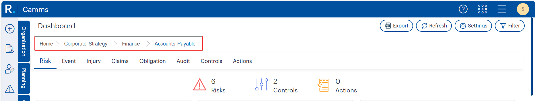 Figure 3.2: The breadcrumb trail reflects the selected hierarchy path, helping users maintain context as they navigate through specific departments like Corporate Strategy, Finance, or Accounts Payable.
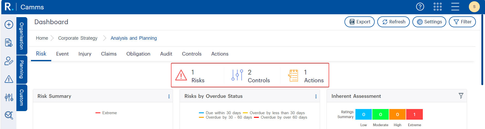 Figure 3.3: Real-time dashboard widgets automatically update based on the selected hierarchy level, offering focused insights into the number of risks, controls, and actions for departments like Analysis and Planning.
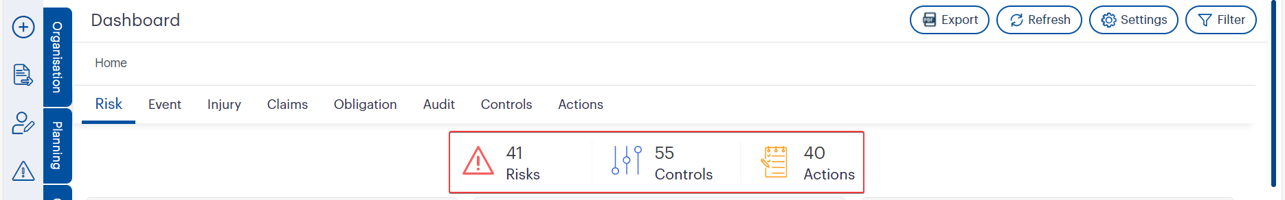 Figure 3.4: Real-Time Dashboard Summary in GSP - Risk displaying the number of Risks, Controls, and Actions. These high-level visual indicators update dynamically based on the selected hierarchy level, offering immediate clarity on risk-related activity within specific departments or units.
 Fig 3.4 – Risk Assessment by Hierarchy Node Bar Chart in GSP - Risk displaying the distribution and severity of risks across organisational units. This enables targeted reviews and escalation where critical or major risks are concentrated.
Dashboard Toolbar Functions
The dashboard interface includes essential utilities that make managing risk data easier, more efficient, and customisable in real time.
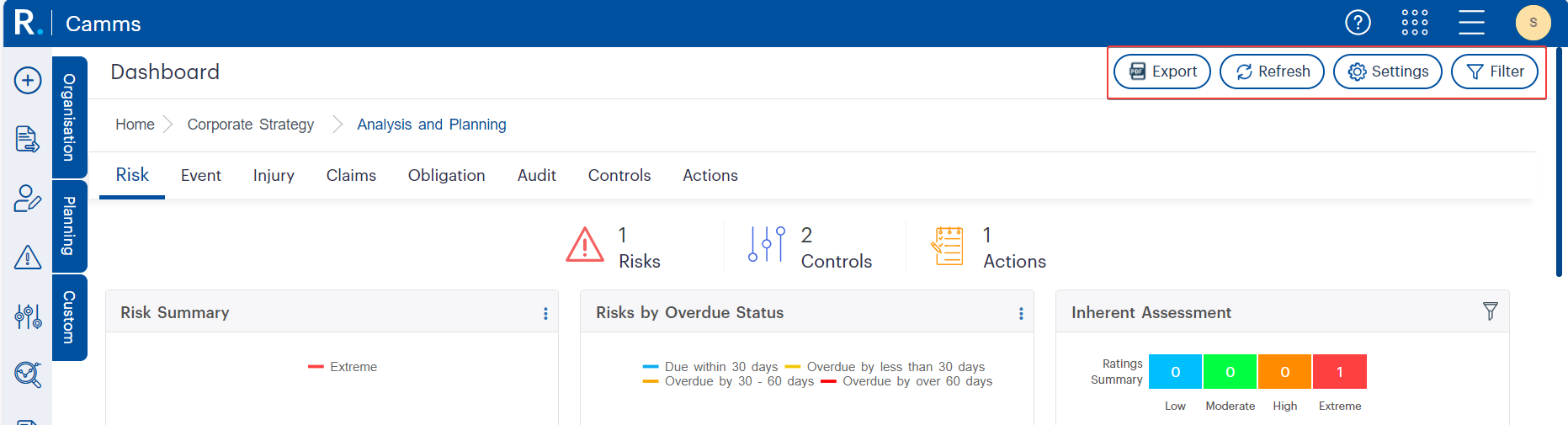 Figure 4.1: Dashboard-level tools like Export, Refresh, Settings, and Filter offer users quick access to customisation, real-time data updates, and PDF export options—supporting streamlined reporting and personalisation.
Widget Customisation
Admins can tailor dashboard views at an organisation or user level: choose chart types, rename widgets, control display order, assign colours, and define favourites for quick access in the Overview tab.
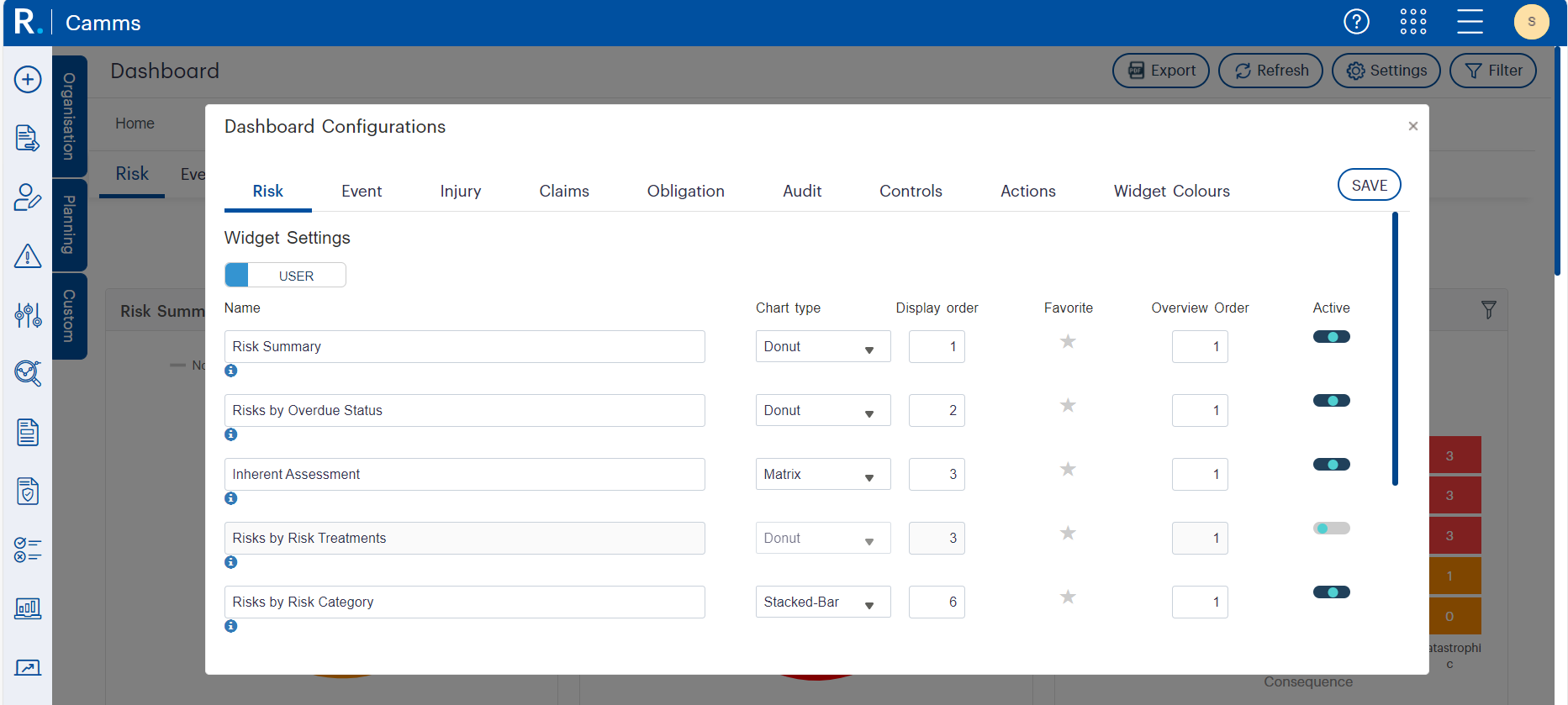 Figure 5.1: Dashboard Configuration Panel in GSP - Risk showing customisable widget settings including chart type, display order, and active status. This utility enables administrators and users to personalise dashboard layouts for better visual clarity, streamlined reporting, and faster access to relevant risk insights.
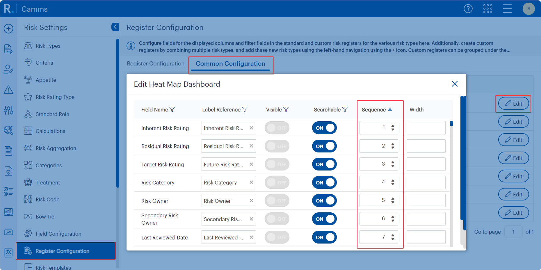 Figure 5.2: Register Configuration screen in GSP - Risk showing editable field properties for the Heat Map Dashboard. Admins can control visibility, searchability, sequence, and field width, allowing precise alignment of risk fields with reporting and governance needs.
 Figure 5.3: Donut Chart Widget in the Risk Workspace Dashboard showing a visual Risk Summary. Each segment represents a different risk rating level (Not Rated, Low, Moderate, High, Extreme), offering an at-a-glance view of overall risk distribution within the selected hierarchy.
 Figure 5.4: Risks by Overdue Status Donut Chart in GSP - Risk highlighting risks due or overdue within specific timeframes. The majority of risks shown here are overdue by more than 60 days—visually flagging areas that require urgent attention.
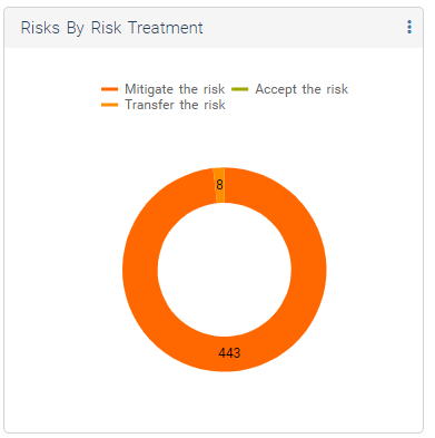 Figure 5.5: Risks by Risk Treatment Donut Chart displaying the distribution of treatment strategies. The overwhelming majority are being mitigated, with a small portion transferred—visually reinforcing where the organisation’s risk response efforts are concentrated.
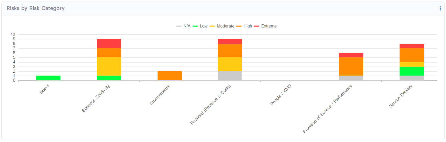 Figure 5.6: Risks by Risk Category Stacked Bar Chart in GSP - Risk illustrating the distribution of risk ratings across categories such as Business Continuity, Financial, and Service Delivery. This view helps identify high-risk areas and guides targeted mitigation strategies.
Advanced Filtering
From filtering risks by last review date, type, or owner to isolating overdue actions or low-rated controls, each tab offers powerful filters to refine your view.
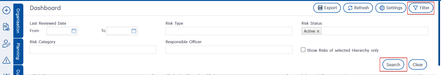 Figure 6.1: Advanced Filtering Panel in GSP - Risk allowing users to search by review date, risk type, status, category, or responsible officer. The ‘Search’ and ‘Clear’ options provide quick data refinement and reset, while the ‘Filter’ toggle ensures streamlined access to this powerful feature.
Interactive Popups
Click into widgets to view detailed, tabular pop-ups of records. These popups can be configured (fields, labels, widths) to suit your reporting needs, enabling fast access to granular insights.
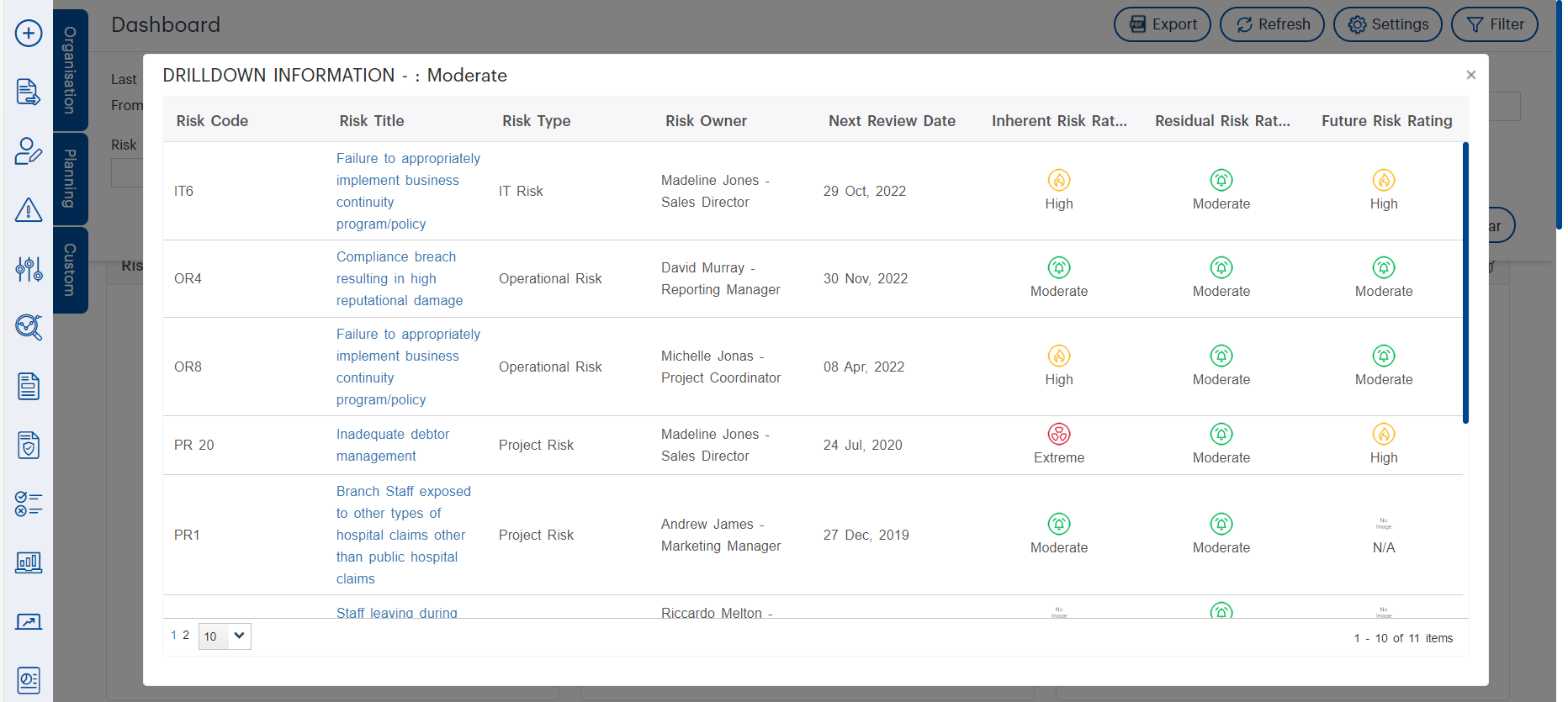 Figure 7.1: Interactive Drilldown Popup in GSP - Risk displaying a tabular view of risk records. This detailed view includes key data such as risk type, owner, review dates, and assessment ratings—enabling users to analyse and compare multiple risks from a single dashboard interaction.
 Figure 7.2: The Register Configuration screen in GSP - Risk allows administrators to customise fields shown in dashboard popups—including for Actions, Incidents, and Recommendations. This flexibility enables organisations to align popup data views with operational needs and reporting standards.
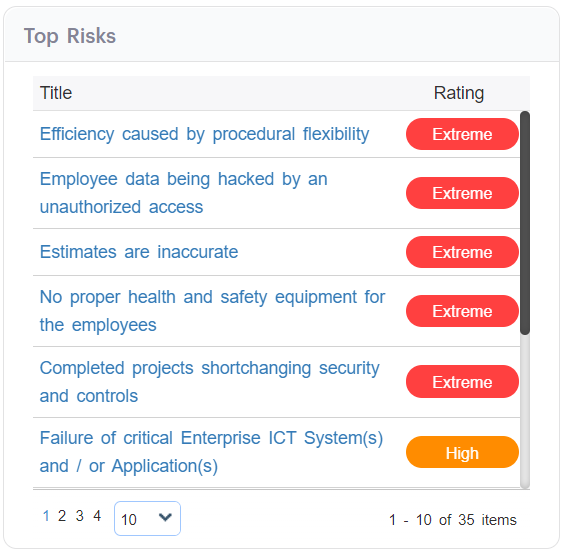 Figure 7.3: Top Risks Widget in GSP - Risk listing high and extreme-rated risks in a tabular format. This snapshot aids executive and risk teams in prioritising immediate attention areas and tracking high-impact threats across the organisation.
Visualise risk ratings across inherent, current, and future assessments using matrix widgets that adapt to your organisation’s rating formulas (e.g., L×C, or more complex variations). Perfect for seeing where mitigation efforts are making an impact—or not.
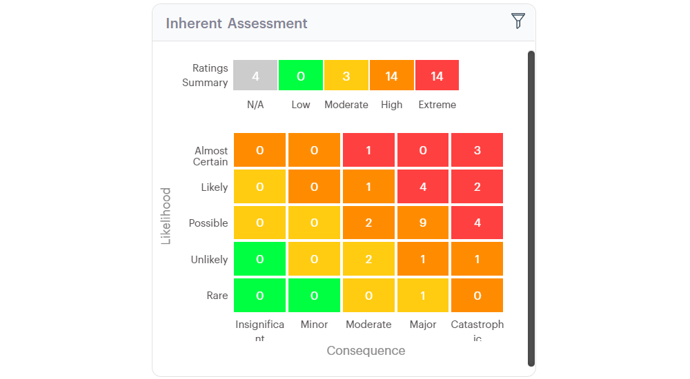 Figure 8.1: Inherent Risk Assessment Matrix in GSP - Risk visualising the distribution of risk ratings across consequence and likelihood levels. This heatmap helps stakeholders quickly identify clusters of high and extreme risks that require attention.
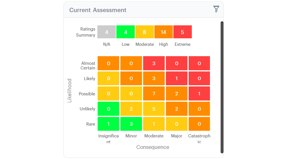 Figure 8.2: Current Risk Assessment Matrix in GSP - Risk visualising post-mitigation risk exposure. This heatmap enables users to evaluate whether implemented controls have successfully reduced overall risk severity.
 Figure 8.3: Future Risk Assessment Matrix in GSP - Risk displaying the projected risk landscape based on anticipated control effectiveness. This heatmap helps organisations evaluate whether strategic mitigation plans will reduce overall risk exposure over time.
 Figure 8.4: Risk Heat Map Analysis in GSP - Risk combining a configurable matrix with a detailed tabular listing of associated risks. This dual-pane view enhances traceability and enables users to immediately investigate risks by code, type, rating history, and responsible officer.
Monitor controls by effectiveness ratings or actions by progress status. Overdue filters make follow-up easy, especially in regulatory contexts where timing is critical.
All these features—and more—are broken down in full in our support article.
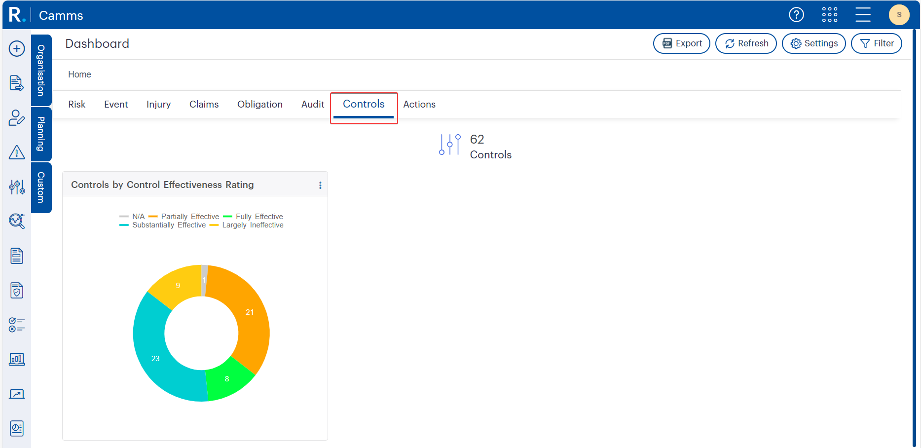 Figure 9.1: Donut chart visualising the distribution of control effectiveness ratings within GSP - Risk. Users can quickly assess the number of controls that are Fully, Substantially, or Partially Effective, as well as those rated as Largely Ineffective or not yet assessed. This visual snapshot helps prioritise follow-up actions and improve assurance reporting.
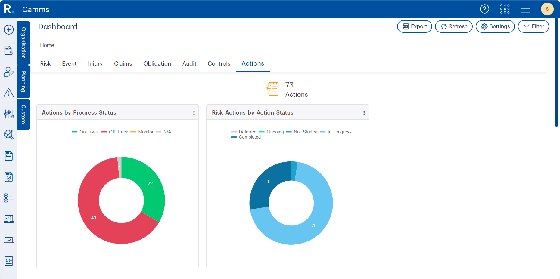 Figure 9.2: Dual donut charts in GSP - Risk visualising actions by progress status and risk actions by overall status. These widgets help users identify which actions are on track, off track, or not yet started—enabling proactive follow-up and timely intervention across risk management programs.
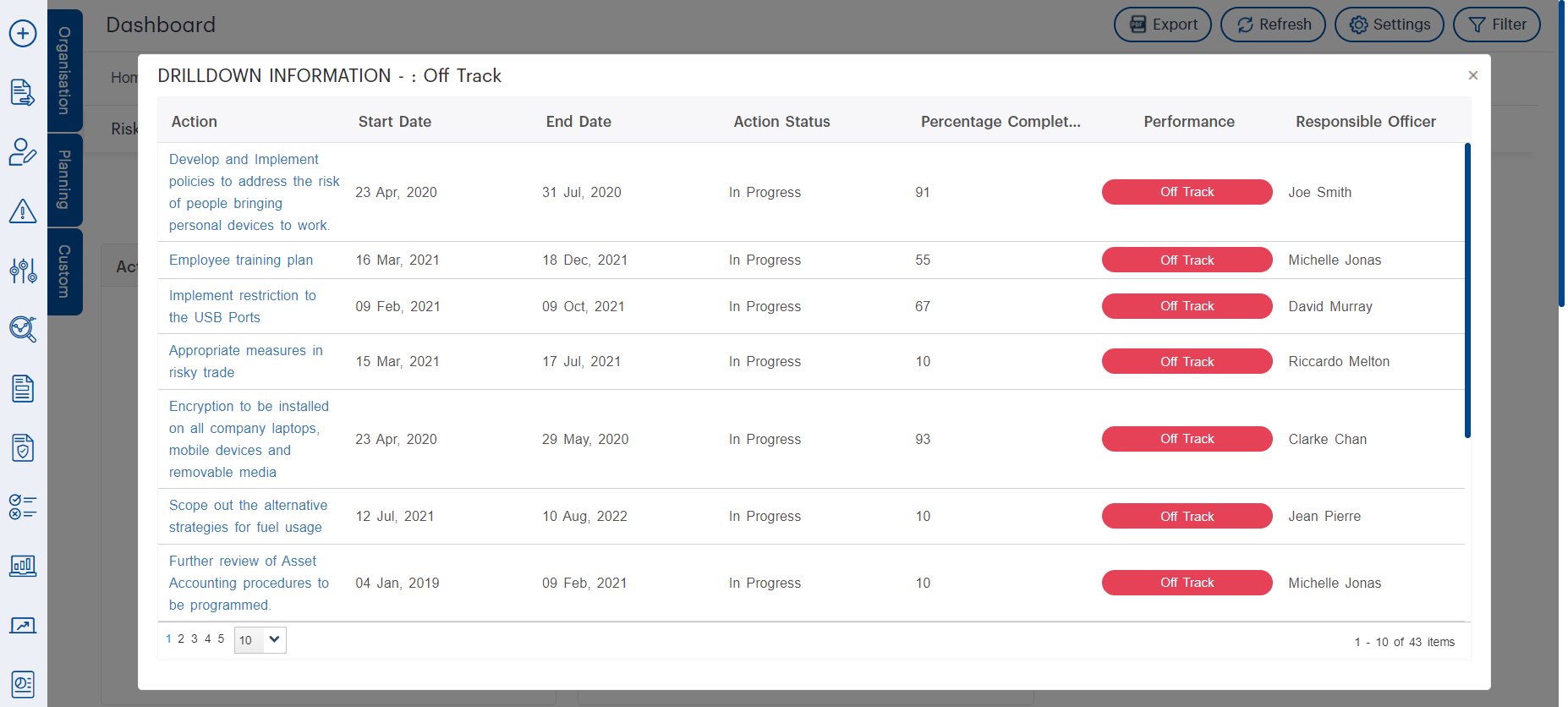 Figure 9.3a: Detailed drilldown popup in GSP - Risk showing risk actions marked as “Off Track.” Users can view the action title, timeline, progress, and responsible officer—helping teams pinpoint delays and follow up with accountability. This functionality supports performance tracking and timely remediation.
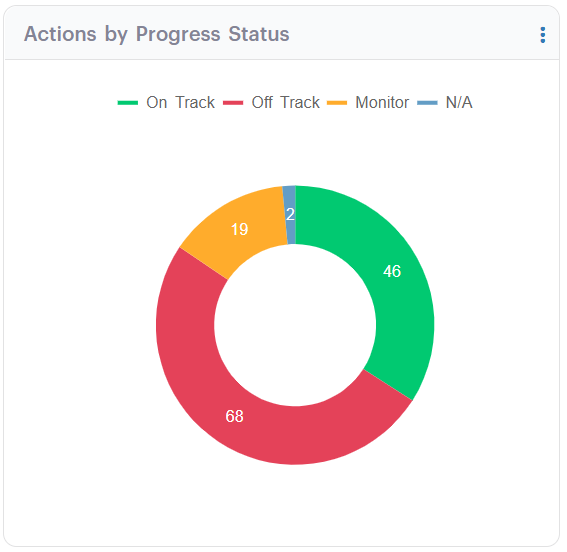 Figure 9.3b: Donut chart visualising the latest distribution of actions by progress status in GSP - Risk. With 68 actions currently Off Track and only 46 On Track, this chart highlights key areas needing attention and timely escalation across the organisation’s risk and compliance initiatives.
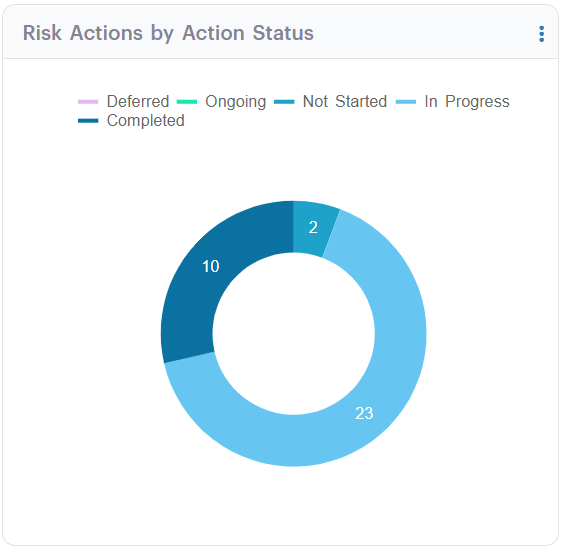 Figure 9.3c: Updated donut chart displaying the distribution of Risk Actions by Action Status in GSP - Risk. The majority are still in progress, with a smaller share marked as completed or not started. This snapshot supports targeted reviews by helping teams monitor the lifecycle of critical risk actions.
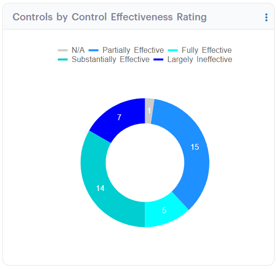 Figure 9.4: Updated donut chart visualising the distribution of control effectiveness ratings in GSP - Risk. This clear and colour-coded summary helps users quickly interpret the spread of Fully, Substantially, and Partially Effective controls, along with those rated Largely Ineffective or N/A, driving informed remediation actions.
 Figure 9.5: Interactive drilldown popup displaying control records rated as 'Partially Effective'. This detailed tabular view offers insight into the type, review date, control authoriser, linked records, and associated effectiveness ratings—enabling users to identify underperforming controls and take corrective action.
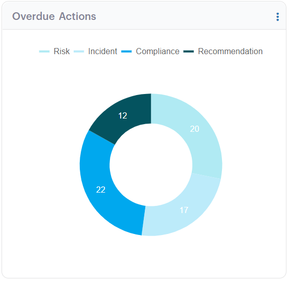 Figure 9.6: Overdue Actions by Category in GSP - Risk - This donut chart breaks down overdue actions across Risk, Incident, Compliance, and Recommendation types. By visually identifying where action backlogs exist, the widget supports better prioritisation, accountability, and targeted intervention—particularly valuable in audit preparation or regulatory contexts.
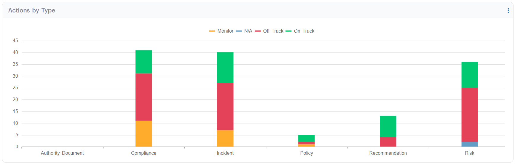 Figure 9.7: Action Status Breakdown by Type in GSP - Risk. This stacked bar chart visually compares the progress status of actions across key categories such as Compliance, Incident, and Risk. By highlighting which areas have the most 'Off Track' or 'Monitor' actions, this widget empowers users to prioritise follow-up efforts and ensure accountability across functional areas.
We understand that every organisation structures risk differently. Whether you are new to GSP – Risk or looking to optimise your reporting suite, our team is here to help.
Our Virtual Consultants work alongside you to design dashboards that reflect your organisation’s structure, reporting requirements, and industry regulations. From widget configuration to real-world scenario planning, we will help you move from raw data to results that matter.
Want to See It in Action?
Do not miss our upcoming webinar, ‘The Power of Hierarchy Linkages and Dashboards within GSP – Risk’, where we will take you through live demonstrations, best practices, and common pitfalls to avoid. This is your chance to see how others are using dashboards to power smarter risk decisions.
Let Us Help You Make It Work
You do not need to do this alone. Whether it is configuring widgets, linking risks to hierarchy nodes, or designing a reporting strategy, our experts are ready to help.